Monday 28 July 2008

Never Trust a Smiling Succubus?

So, she approaches you, with bright smile and cute-but-curvy looks. Talks sweet nothings to your ear. Why should there be anything to worry about? Horns? What horns?


Markers and black pen on paper. Inspiration from one of the greatest webcomics out there, Sinfest. That comic's been running for eight years straight and still going strong.

Sunday 6 July 2008

Bubblun

This project has been unfinished for far too long, so this week I decided to complete it. And now it's finished, at last! So let me present to you: my own super-huggable video game plushie.


Made of cotton cloth, fiberfill, a bit felt and plenty of thread, it's my second hand-made plushie. The first was Tux, made to the Free Penguin Project patterns.

Wednesday 2 July 2008

Filter effects: Lighting effects

This is part of my filter effects tutorial series

Lighting effects can help in creating a feeling of depth in you image. They take in a height map and various light and material parameters and produce a light map. This light map can then be composited with your object to produce a result that looks like light falling on the object.

There are two lighting filters: Diffuse Lighting and Specular Lighting. This is how lighting is usually created in computer graphics. Diffuse is how the light reflects off a completely matte object, the sides facing light are brighter and sides facing away from light are darker. Specular in turn is how the light reflects off a smooth surface, it creates bright spots where the light reflects towards the viewer.

There are two other common lighting properteries: ambient lighting and mirror reflection. Ambient is the light that doesn't seem to come from any particular direction. In filter effects, ambient component comes from the original colour of the object. Mirror reflections, as the name states, are reflections that show the image of other objects. Mirror reflections are not supported by this simple lighting model.

First, before I'll explain these filters more throughly, I'll tell you a bit about height maps. SVG drawings are two-dimensional and as such, they don't actually contain any depth information. Without depth information, everything in the scene is completely flat, and lighting totally flat objects would be rather useless, because everything would be of same brightness. Height maps are used to overcome this problem. Any image can be used as height map, the transparent areas of image are the lowest point and the more opaque a point is, the more it is considered to be above image plane.


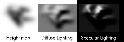
In this image, the height map here is completely black and lighter shades are more transparent areas. The light comes from top-left. You can see how this height map is used to create the looks of light falling on three-dimensional object.

For practical uses, it is often useful to create the height map automatically from the filtered object. Gaussian Blur, for example, is handy for this. The next image shows a height map derived from original object by Gaussian Blur

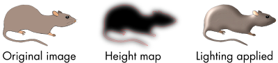
Again, the white areas in height map are transparent and more dark areas more opaque. The red line shows the original shape of the object, it's not actually part of the height map. The used lighting filter is from examples/lighting-filters.svg from Inkscape distribution. The result looks more like some rat-shaped badge than an actual rat, but I'd guess, it's quite fine for demonstration purposes.

So, enough of height maps, let's go to the actual effects. I'll start with Diffuse Lighting.

Diffuse Lighting is, as I stated above, the light reflecting off a completely matte object. In reality, it's hard to find any such object, but cotton cloth, unpolished stones, bricks and other such materials with highly uneven surfaces come close.


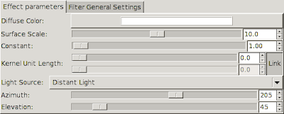
There's a bunch of settings for Diffuse Lighting, so let's go through them.

Diffuse Color sets the light colour to be used.
Surface Scale determines, how to map the height map to actual height values. The bigger the value, the higher the peaks of height map. Also, you can move this to negative side, to turn the peaks into valleys.
Constant modifies the strength of the light. High constants result in harsh lighting and strong contrasts between the light and dark areas.
Kernel Unit Length is not yet used in Inkscape. It is used to make the result resolution-independent. Now that it isn't used, with high zooms you can see odd plateaus forming. (There's an other way around this, though it requires using XML editor. See examples/lighting-filters.svg in Inkscape distribution)
Light Source determines the type of light used. Available settings below that also depend on type of light used.

The resulting image from Diffuse Lighting is fully opaque. It is best used by multiplying the colour values with the colour values of original image. This can be accomplished with Composite filter in Arithmetic mode and multipliers set as K1=1.0, K2=0.0, K3=0.0, K4=0.0. (See Composite tutorial for more through explanation of these factors)

Specular Lighting simulates light reflecting off a smooth surface. Plastic and metallic objects often have strong specular reflections, though for really smooth objects mirror reflection can become dominating.


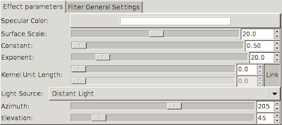
Most settings for Specular Lighting are same as for Diffuse, so I'll just go through the new ones.

Specular Color is the same as Diffuse Color, it determines the light colour.
Exponent is completely new here: it determines the shininess or smoothness of the object. Low values correspond to not-really-shiny objects, high values to really smooth objects. Essentially, the higher the exponent value is, the smaller and sharper the shiny spots are.

Specular Lighting filter produces an image, that is filled with Specular Color, but opaque only where the specular highlights should fall. It is best used by adding the colour values with the colour values in the original image, or the colour values of diffuse shaded image, if you're using both lighting modes. This can be done with Composite filter in Arithmetic mode and multipliers set to K1=0.0, K2=1.0, K3=1.0, K4=0.0.

Although the filters I've shown here have used Gaussian Blur to create the height map, this is by no means a requirement. Any image will do, though preferably one with several shades of opacity. For example, using result of Turbulence filter as height map can create interesting effects. Here, I've used turbulence to create an effect that looks somewhat like crumbled tin foil.

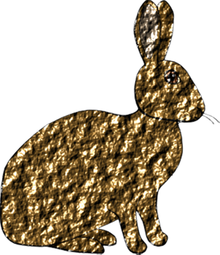
The filter is available in Inkscape distribution in file examples/turbulence_filters.svg

Saturday 31 May 2008

Big Buck Bunny

You may remember the Elephants Dream, the open short movie. It was developed as project Orange at the Happy Blender Institute. Now, a new team working on project Peach at the Blender Institute has published their work: an open short movie Big Buck Bunny.

At LGM, I had the pleasure of watching this great movie on a big movie theatre screen.

Elephants Dream was a technical masterpiece, showing the quality of graphics that can be accomplished with open source programs, it was somewhat lacking in the area of storytelling. While I'm guessing this dreamlike drifting to different directions was intentional at least to some degree, it just felt somehow odd to me. Maybe I just don't understand the fine art ;)

Things look quite different in Big Buck Bunny. It's still a technical masterpiece, actually they've bumped the graphics quality up a notch or two with fur, grass and all such natural phenomena. But the bigger difference is in storytelling. This movie tells a simple story in easy to follow manner, with loads of humour. Some might think that it underestimates the mental capacity of viewers, but I digress. It's nice entertainment.

Other interesting thing from Blender Institute is the project Apricot, which is creating an open source game using Blender, CrystalSpace and several other related tools. I've tried the released versions of these tools, and from what I saw at LGM, this project has made huge improvements to them. Already with the release versions, you can edit stuff like models, textures and actions between the player and scenery in Blender and export all that to the game engine. With the development version project Apricot has, it's possible to actually have the game engine running in a blender window while you can edit game data in other windows.

Friday 30 May 2008

Fun with markers 2: Freefall

A couple days ago I bumped into a great webcomic Freefall. One thing that caught my interest was how well the artist is able to express the characters' moods, reactions etc. in small scale and with just a couple lines. I decided to try and imitate that style.

So, here's Florence Ambrose, a Bowmans Wolf and a technician, from Freefall:


While I'm not quite happy with the colours (I need more brown shades!) I think that came out quite well.

For those who've been following this webcomic, finding the strip with Florence posing like that shouldn't be a hitch.

Also, I noticed that there are some interesting colours in my palette:

Blender, Orange and Apricot. Too bad, there's no colour Peach in my palette nor in ProMarker colour range.

Thursday 29 May 2008

Filter effects: Convolve Matrix

This is part of my filter effects tutorial series

Convolve Matrix can be used for several different effects like blurring, sharpening, edge detection and embossing. While it's a powerful tool, it can take quite some expertise to create the desired effect.

Inkscape support for Convolve Matrix filter primitive is not yet quite finished, but it can already be used for some work. The biggest problem is, the results will depend on the rendering resolution.

The idea of this filter is to apply a convolution on image. Basically, it takes certain amount of pixels around the target pixel, multiplies the colour values of each pixel by its multiplier and sums them up to form new colour value for the target pixel. There also exists common divisor and bias that will be applied after summing pixel values up.

For more through and mathematical explanations of convolutions, see Wikipedia page on Convolutions or article on Matrix convolution filters on GameDev.net.

Here's an graphical example with single target pixel and the 3×3 area surrounding it.


This same filter is specified in Inkscape Filter Effects dialog as follows:


Two special notes here: first of all, the bias is specified as 128 in the first image but as 0.5 in second image. These are actually the same thing, the first image just uses colour values in range 0–255, the second image in range 0–1.

Second, the divisor isn't actually required. I could have specified the kernel with values of -1/8 and 1.0 and left the divisor as one. The divisor just makes specifying the values easier.

Here are some examples of possible effects:

Box blur:

(notice though: usually it's better to use the Gaussian Blur filter primitive for blurring)

Motion blur:


Edge detection:


Sharpen:


Embossing:

Thursday 22 May 2008

Rant: Curly Braces

I bumped into an writing called Java: Braces are your friend. While I can see that there are good reasons to use braces after every if statement (or after for, while, do...), the reasoning seemed a bit off.

First of all, it states that the following is allowed, but dangerous:

if (condition)
Exactly one statement to execute if condition is true
else
Exactly one statement to execute if condition is false

Well, all fine and dandy and I can see where it's aiming to. The thing is, that very form is the only form that exists. The braces just serve to gather several statements up to form a single statement, they're by no means part of 'if' syntax.

The first actual reason stated, as to why not leave the braces out, is the following situation

if (condition);
do_something();

Well, OK. I can see how one can accidentally type the semicolon after the if clause. But then again... Hello, it's 2008 calling! You won't believe what cool things our program editors nowadays have. They colour the different parts of code with different colours and you know what: they even indent your code for you! Amazing, ain't it?

if (condition);
do_something();

That certainly doesn't look like such a big error anymore. Also, if one can go and write an extra semicolon after the if clause, why couldn't this happen as well?

if (condition); {
do_something();
}

Even automatic indenting won't save you from that!

The other reason is one, I think I've seen quoted a few too many times:

if (condition)
do_something();
do_something_else();

Yes, the old case of "What if someone later on wants to add more functionality to the if block?" Well, 2008 calling again and all that. Try writing that to any even semi-decent programming editor. It becomes this:

if (condition)
do_something();
do_something_else();

Not so dangerous error anymore, either. You can clearly see that the second statement doesn't belong to the if block.

Also, it crossed my mind that both these errors become invalid code, if you have an else block after that if. That's pretty much a corner case though.

Thursday 8 May 2008

LGM has begun

The Libre Graphics Meeting 2008 has now begun and I'm here. I arrived yesterday and it's been a bit of a crash course to life in Poland. Stuffed buses, not having a common language with shop clerks, trying to find a place where to eat and all that. But I am now here at the conference hall and I've already have met several interesting people and heard of some completely new projects.

For these new projects, it's now nearing to the end of presentation about Phatch, a patch editing application for images.

Tuesday 6 May 2008

When PCI is not PCI

This week I bought two new peripherials for my computer: an USB 2.0 controller card and a sound card. Before you ask, yes, neither of those are integrated on the motherboard. Originally it wasn't a desktop machine but a server.

The first problem I encountered was when I tried to insert the A-Link U2P4 USB 2.0 controller in a PCI slot. It just didn't fit. The PCI connector on the controller had different keying from the PCI slot on my motherboard. While I could have made it fit using a hacksaw or something, that didn't sound like a good idea. I didn't understand the situation at all, so I looked up the PCI page from Wikipedia. What I learned was, that there are several versions of the PCI bus. The card I had in my hands was built to use 5 volt signalling and my motherboard used 3.3 volt signalling.

Further looking into different PCI versions revealed that the last version of PCI standard allowing for 5 volt only cards was deprecated already in 2004. It seems, that all new PCI cards should be able to use both 5 and 3.3 volt signalling or even 3.3 volts only.

The second problem was with the sound card, a Terratec Aureon 5.1 PCI (aka. Fun). I was able to plug that one in, but that's just about how far I got. Whenever I tried to turn the computer on, it would turn the power on for a split second and then power off. Just enough to make the fans twitch a bit. I don't really have a way to tell for sure what's the reason, but it seems that the card was short-circuiting some of the power lines, and thus causing the power supply to cut the power.

It may have been, that I just had an faulty card at my hands and if I exchanged it for a new one, it would have worked just fine. Also it may have been that the card is faulty by design and assumes that the signal voltage and +5 volt supplies are at the same voltage, thus shorting the +5V and signal voltage pins. What makes me to even suspect the latter is that I found notions that similar things have happened and that the sound card package showed a picture of a 5 volt only card. If the actual electronics hadn't been revised when the board was changed to universal type (both 5V and 3.3V) that's pretty much what would have happened. I already returned that card to the store for refund, so I don't have real evidence to back up that claim, so as I said, it could have just been one faulty card among a bunch of working cards.

Friday 2 May 2008

Filter effects: Composite

This is part of my filter effects tutorial series.

Composite is, as the name states, an effect that can composite images together. It uses the Porter-Duff blending modes named after the writers of the paper, where it was published. For those of you with ACM Digital Library access, here's a link to the original paper: Compositing Digital Images: Porter, Duff.

The Porter-Duff blending modes are basically logical operations applied to images. For example, you can go and take an exclusive or of two images. In the original paper there was a table showing an example of each mode and some variation of that has been included in most places, where these modes are explained. Now that I have my two test subjects, Max the rat and Gina the rabbit, I can use them instead of boring triangles.


From this image, one can notice several useful relations between the different modes: over is actually the ordinary alpha compositing, out and atop are complete opposites of each other, as are in and xor.

There is a gotcha for making this kind of images: whenever you use the Background Image you need to enable it and to remember that the filter output doesn't replace the background but instead is composited over it. So, if you just created composite filter with xor mode, you'd notice that it just seems to change the compositing order. The gotcha is that the area where the both objects are atop each other is transparent and shows through the original background. So, to make these images, I actually created a solid background inside the filter to hide the original background.

There is also a sixth mode called Arithmetic. It allows you to specify the result as linear combination of input image colours. Put other way, you can specify four constants K1-K4 for the equation (result colour) = K1 * (input 1 colour) * (input 2 colour) + K2 * (input 1 colour) + K3 * (input 2 colour) + K4. With these, you can take sum of two colours (K1 = 0, K2 = 1, K3 = 1, K4 = 0), product of two colours (K1 = 1, K2 = 0, K3 = 0, K4 = 0) and plethora of other combinations. Here are a couple examples

Monday 28 April 2008

Animal test subjects

I noticed some time ago that using five pointed stars as example material is growing a bit old. I needed something new to test these filters with. So, I came up with the idea of using animal test subjects. Here are the two: Max and Gina.

While animal testing can be cruel and inhumane, I promise to treat my two test subjects kindly. You'll be seeing them in new Filter Effects tutorials shortly.

Thursday 24 April 2008

Fun with markers

Almost two weeks ago I was looking to buy more colour pencils, as my old set of 12 pencils didn't include any skin tones. Well, I found me a nice 24 piece set, which still doesn't contain many skin tones and actually I already had half of those colours. I would probably been better off finding a retailer with loose pencils and buying a couple skin tones.

Well nevertheless, colour pencils weren't what I was going to blog about. Markers are. At the same trip, I noticed some sets of markers next to the colour pencils. There were sets in different styles: bright colours, grays, skin tones... Wait, that's what I wanted, wasn't it? Well, I ended up buying a comic art set with one skin tone, brown, blue, red and black so I could test them out.

I tested those five markers out and I totally liked them. They're rather fast to work with and they produce strong and brilliant colours. But, five colours is rather limiting. So, after weekend I went and bought some more and now I'm a happy owner of some twenty Letraset ProMarkers. Nothing too much, but as even those cost a bit much for my budget, they'll have to do for now.

But, let's cut the long story short, here's a picture I drew with those markers:Well, ok. I did use a bit more than markers: black ink pen for the lines and colour pencil to smooth out the background somewhat.

One thing I can't seem to figure out, is how to draw areas of flat colour. Look at the floor in previous image, for example. While using special paper meant for marker drawing alleviates this problem somewhat, it's still really easy to get visible stripes.

Sunday 20 April 2008

Filter effects: Color Matrix

This is part of my filter effects tutorial series.

Color Matrix is an interesting filter, that can mix up the colours in your image in many ways. Blanc and white images, sepia toning, hue rotation and removing one of the basic colours from image are a couple examples, what kind of modifications this filter can do.

The mathematical idea behind Color Matrix is, that it multiplies the colour of each pixel by a 5×5 matrix. SVG won't let you to specify the whole matrix, but only the first four rows. The last row is always "0 0 0 0 1", which means that the imagined fifth colour value will always be one. (red, green, blue and alpha are the four actual colour values)

Nevertheless, you don't need to know much about the mathematics to be able to use this filter. Let's take an example image from Inkscape Filter Effects user interface:
Here I've specified an sepia tone filter. Not too good one, but it'll make for an good example about how these work.

So, what are all these numbers?
The basic concept here, is that each column represents an input colour: red, green, blue, alpha and constant addition. Each row in turn represents an output colour: red, green, blue and alpha. For example, the first row means "Take 0.14 times the red value of a pixel, 0.45 times the green value a pixel, 0.05 times the blue value of a pixel and zero times the alpha value of a pixel, sum these and add zero. The result is the red value of output pixel"This same process is applied to all primary colours of a pixel for every pixel in the filtered area.

The fourth row of this example filter is also noteworthy. Not only it defines the modification applied on the alpha channel, it also is an identity modification. Here on the alpha row, alpha is multiplied by one and all other inputs by zero, thus preserving the original alpha channel. With the same idea, you could for example swap the contents of green and blue channels:

Besides the matrix mode, the Color Matrix filter provides also three convenience modes, so you won't have to create the whole matrix every time:
Saturate: this is a bit funny name, as this Saturate actually desaturates the image. You are provided with a slider allowing you to choose from full scale between full saturation and zero saturation (black and white).
Hue Rotate: this does just what it says, it rotates the hues of your image. If you rotated the colour wheel in Fill and Stroke dialog same amount for every colour in filtered object, the effect would be just about the same.
Luminance to Alpha: this can be handy as part of bigger filter, it turns the luminance of input image as opacity of output image. White areas become totally opaque, black areas totally transparent and everything other becomes something in between.

I've found Color Matrix especially handy for adjusting the output from Turbulence filter, as Color Matrix can change the colour of an image, make areas with low alpha values completely transparent etc. The following examples are from turbulence_effects.svg included in Inkscape distribution and they use both Color Matrix and Turbulence:

Filter effects: Blend

This is part one of my filter effects tutorials, where I'll describe the filter effects existing in Inkscape and general information about using and creating filter effects.

The blend filter composites two images pixel by pixel. It provides four compositing modes common in raster graphics editors: multiply, screen, darken and lighten. Also, it can be used to do the normal alpha compositing used in SVG.

Blend is also other one of the filters, that can be used without going to filter effects dialog in Inkscape: it is used to provide the layer blending modes.

The different blending modes work as follows:
Multiply: works like mixing pigments. Magenta and yellow make red, red and cyan make black etc.
Screen: works like mixing lights. Red and blue make magenta, magenta and green make white etc.
Darken: works like normal compositing, but composites both first image on top of second and second image on top of first and takes the darker result for each pixel and each colour channel, efficiently making the resulting image darker than either of source images.
Lighten: like darken, but takes the lighter results.

For multiply and screen, the following image might explain this better than I can:
On left: red, green and blue (RGB) circles composited with Screen.
On right: cyan, magenta and yellow circles (CMY) composited with Multiply.

For more complex effects, blend can be a handy tool when collecting several parts of the filter effects chain together.

There are a couple gotchas with blend filter in Inkscape and in general:
First, while Inkscape provides you with layer blending modes, such a concept doesn't actually exist in SVG 1.1. When you specify a layer blending mode, Inkscape creates a blend filter, that takes everything with lower z-index as your layer and composites that with your layer contents. This is the filter result. The filter result is then composited on the canvas, on top of everything with lower z-index. If your drawing has a solid background, this is just fine. If the background is not solid, it will be drawn twice. You may end up with funny looking results like in the following image:
On the top, over solid white background, everything works just fine. But on the bottom over transparent background, you can see a box appearing around the small star.

The other gotcha is the enable-background property. If you want to use background image as part of any filter, that property must be set. Some parent node of the object, you are applying the filter to, has to have this so that SVG renderers know, what part of background you want to use for compositing. This only applies to hand-made filter effects, if you use the layer blending mode combo box, Inkscape will take care of setting this property for you. For now, the easiest way to set enable-background so that you can use background in your filters, is to set some blending mode from layers palette.

Tuesday 25 March 2008

Inkscape 0.46

I'm a bit late with this blog post, but now that Inkscape 0.46 is out, all these nice features I've worked on are available in a release version of Inkscape, not just in SVN and nightly builds.

Of course there's also plenty of other great features: paint bucket tool, 3D box tool, new grids... Way too many to describe here, so check out release notes for more info.

Inkscape 0.46 is available at your nearest package management system (well, hopefully) or at inkscape.org

Thursday 20 March 2008

Timing tool

Since getting myself a copy of In The Groove and a carrying bag for my dance mats, I've played dance games quite a lot. Both at my home by myself and at university with some friends.

A couple days ago, while listening to a song, I felt that I had an idea, what kind of steps it should have. I tried making those steps with the StepMania editor. Well, it proved to be nearly impossible to sync the arrows with the music, as the song was recorded by a live band and thus the beat rate wasn't exactly constant. So, I built a program to make the synching easier. It took around ten to fifteen hours to make a fairly usable program, and that time included plenty of testing and playing around with different versions.

So, if anyone wants to give it a shot, the program is available here: smsync.tar.gz. It's a source package, so you'll have to compile it yourself. I've built it on Linux, but I'd believe, it could be usable on other platforms, too.

And the stepfile I wanted to create? Well, it din't turn out nearly as good as this program, so I don't think I'll be publishing it any time soon.

Saturday 12 January 2008

Maybe I could claim this as modern art

I was goofing around with testing Inkscape today. This one is brought to you by filter effects and tweak tool.

Friday 11 January 2008

New Filter Effects Examples

I've created a couple more examples of using Filter Effects in Inkscape or in SVG generally. This time I focused on feTurbulence filter primitive, which fills the filter effects area with Perlin noise.

Perlin noise is often used for texture generation and modeling natural phenomena like clouds and smoke. In SVG drawings it can provide uneveness and noisiness, that is otherwise hard to create.

Each of these six stars has a different feTurbulence based filter applied:
(click on the image for nice & large version)

This example file will be available in SVG format in examples directory in Inkscape 0.46 release. Should you want it already, or you don't want to download all of Inkscape, it's already available in SVN.